Here I will not explain what is candle stick chart in details. But it’s one of the best way to visualize the stock price chart as it contains the OHLC (open, high, low, close) price information of a price chart.
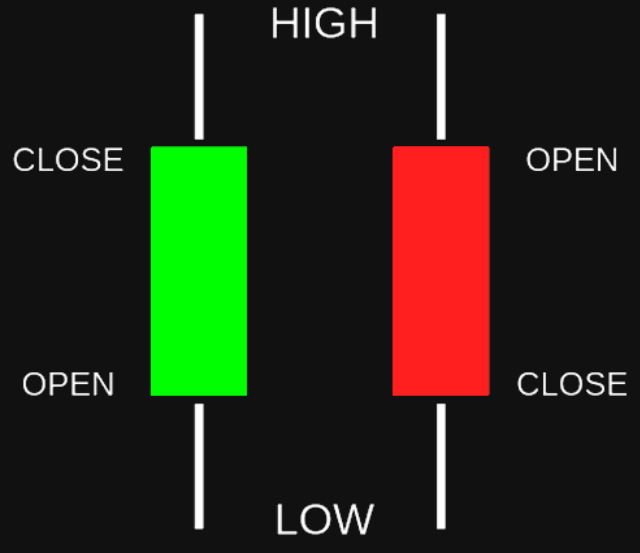
As shown in the above picture, the green body means closing price is higher than opening price and the red coloured body signifies the exact opposite. So, by looking these candle bodies we can easily visualize the market sentiment for that specific period.
How this will help:-
This will help you if you are developing algorithmic trading software or doing a project in finance. By using this code anybody can generate the candle stick chart in bulk for analysis purpose.
Code in python:-
Here in the below example pycharm IDE is used. Anaconda also can be used using the same code base.
Import the all required packages as mentioned below:-
import matplotlib.pyplot as plt
from mpl_finance import candlestick_ohlc
import pandas as pd
import matplotlib.dates as mpl_dates
from sqlalchemy import create_engine
Here I am loading data from a table present in postgressql database. So for that I have to make data base connection. Here sqlalchemy package is used to create the connection engine.
plt.style.use('ggplot')
# Loading of data from postgres table
table_name = 'historical_data'
dbname = 'Stock'
host = 'localhost'
user = 'postgres'
pwd = 'password'
port = '5432'
SYMBOL = "'TATAMOTORS'"

conn = f'postgres://{user}:{pwd}@{host}:{port}/{dbname}'
print(conn)
engine = create_engine(conn)
The post-gres table structure is mentioned below:-
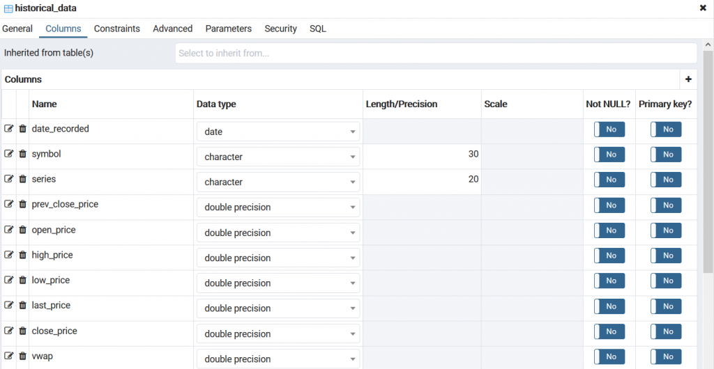
Now from this entire data set only required columns will be selected. For plotting purpose only four fields are required. Here we are loaded the for only one stock, i.e. ‘TATAMOTORS’.
df = pd.read_sql_query(f'select * from historical_data where historical_data.symbol  = {SYMBOL}',conn)
print(df)
#Here only four columns are selected from the entire data set.
ohlc = df.loc[:, ['date_recorded', 'open_price', 'high_price', 'low_price', 'close_price']]
#print(ohlc)

#Now got the price of the tatamotors

#aapl['Date'] = aapl.index.map(mdates.date2num)

ohlc['date_recorded'] = pd.to_datetime(ohlc['date_recorded'])
ohlc['date_recorded'] = ohlc['date_recorded'].apply(mpl_dates.date2num)
Now required parameter values are passed to plot the candle-stick data.
fig, ax = plt.subplots(figsize=(14,7), num='candle chart')

candlestick_ohlc(ax, ohlc.values, width=0.4, colorup='green', colordown='red', alpha=0.5)


# Setting labels & titles
ax.set_xlabel('Date')
ax.set_ylabel('Price')
fig.suptitle(f'Daily Candlestick Chart of {SYMBOL}')

# Formatting Date
date_format = mpl_dates.DateFormatter('%d-%m-%Y')
ax.xaxis.set_major_formatter(date_format)
fig.autofmt_xdate()

#fig.tight_layout()

plt.show()
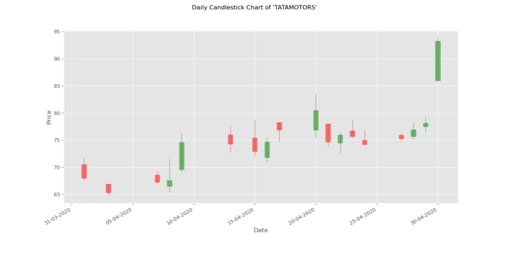
The graph layout will be like:-
Now to create the candle stick chart for multiple stocks in bulk, just pass the different stock symbols using a ‘loop’. I will explain that exactly in the upcoming posts.